Accessibility
Accessible mobile apps work for everyone, including people who use VoiceOver (iOS) or TalkBack (Android). Clear labels, logical structure, readable contrast, and helpful feedback improve the experience for all users.
Built-in accessibility
WaveMaker mobile apps include accessibility support by default. On device, the app uses iOS VoiceOver and Android TalkBack. You do not need extra setup for basic screen reader support.
The app uses widget properties such as Caption for what the screen reader announces. For example, a Button with caption Sign Up is read as Sign Up, button when the screen reader is on.
Test on a physical device or simulator with the screen reader enabled. Studio preview does not fully match on-device behavior.
Add context with Hint
Sometimes Caption and the control type are not enough. Use Hint in the widget Accessibility section to add spoken context after the label.
For example, a Button with caption Submit is read as Submit, button. Add Hint Sends your order so users hear what the action does.
Another example: Button caption Sign Up with Hint Creates a new account is read as Sign Up, button. Creates a new account.
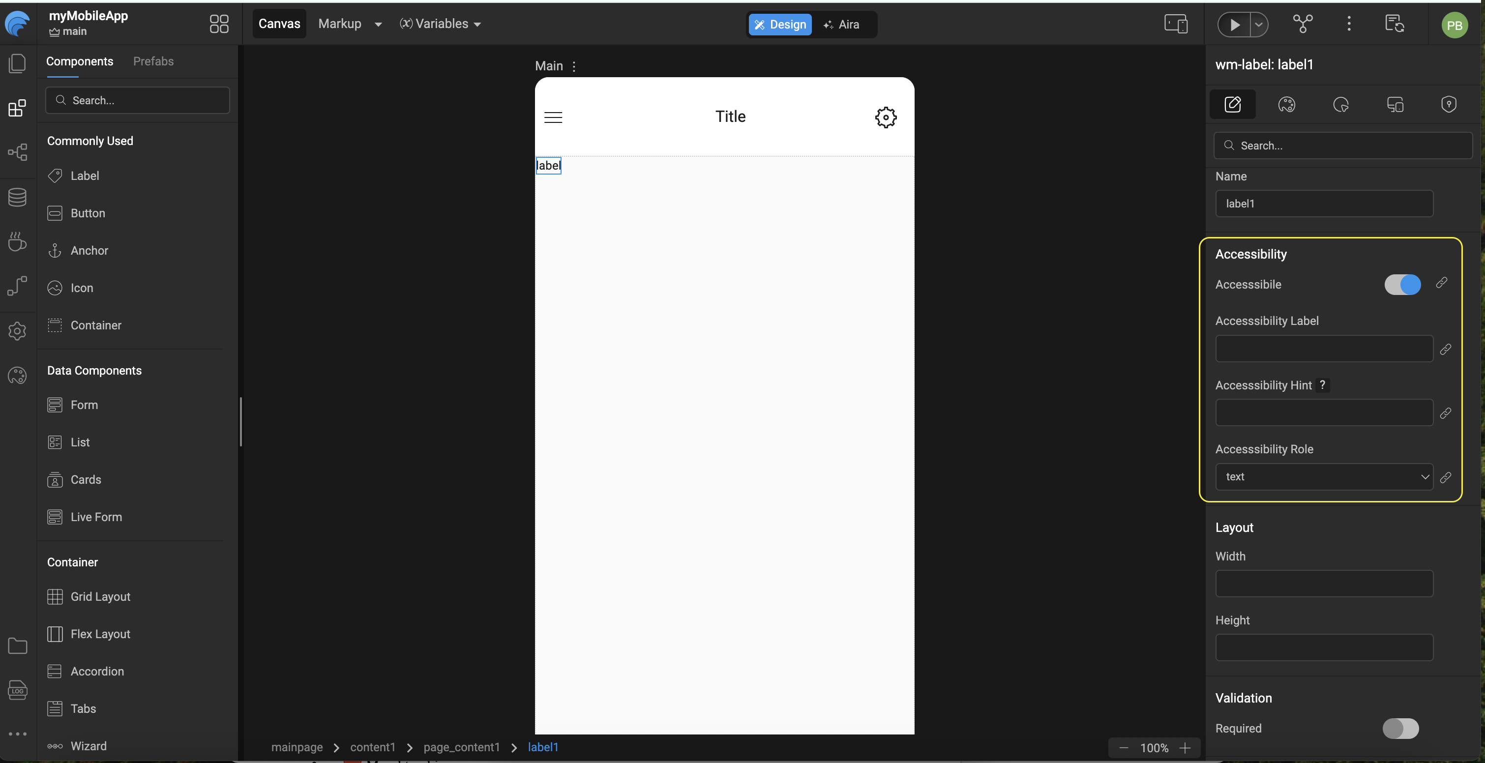
Configure accessibility in Studio
Mobile apps do not use ARIA attributes such as aria-label. In Studio, set Accessibility label when you need a spoken name different from Caption. On web apps, the similar control is often described as aria-label; on mobile, use the Accessibility properties in the table below.
- Select the widget on the canvas.
- In the Properties panel, open Accessibility.
- Set Hint or other properties as needed. You can bind Hint using the bind icon next to the field.
| Property | Purpose |
|---|---|
| Hint | Extra context read after the label (for example Double tap to submit). |
| Accessibility label | Overrides the spoken name when the visible caption is not enough. |
| Accessibility role | Describes the control type, such as button, header, or link. |
| Accessible | Set to false for purely decorative elements so screen readers skip them. |
| Alt text | On Picture (and similar), describes the image. |
Review defaults when you add a widget. Many ship with placeholder text such as Label text or Button.
Example: add Hint to a Label
- Add a Label to the page and set Caption to
First name(replace the defaultLabel text). - Select the label. In the Properties panel, open Accessibility.
- Set Hint to
Enter your first name. You can type the value or bind it to a variable. - Run the app on a device with VoiceOver or TalkBack and focus the label to confirm the caption and hint are announced.
Widgets that support Hint
Anchor, Button, Checkbox, Chips, Currency, Date, Icon, Label, Line chart, Message, Nav, Number, Picture, Popover, Search, Select, Slider, Switch, Text, Textarea, Toggle, Video, Web view
Good practices
- Use clear, descriptive Caption text on buttons, labels, and other interactive widgets. Prefer
Sign Up for newsletteroverClick here. - Add a Hint when the caption alone does not explain the action or field (for example Caption
Pay now, HintCompletes payment for order 12345). - Do not rely on color alone for errors, success, or warnings. Pair visual cues with text such as a validation message on form fields or a Message widget for app-wide status.
- Use design tokens and theme colors so text and controls stay readable on device.
- Set Accessible to
falseonly for decoration that adds no meaning (redundant icons, dividers). - Use heading-style widgets, list group headers, and form titles with Accessibility role set to header where it helps structure.
- Keep a logical reading order in your layout so screen reader focus moves predictably through the page.
- Test critical flows on a real device with VoiceOver or TalkBack enabled before release.
Related topics
- React Native component docs for widget-specific properties
- Design tokens for color and typography
- Auto Layout for touch-friendly spacing and tap targets
- Form input validations for validation messages on fields