Overview
WaveMaker Platform provides
- an open source React Native component library
- a codegen pipeline that transforms WaveMaker Markup into native mobile code and
- a design token system for consistent styling
which enable mobile app developers to build cross-platform iOS and Android applications on the same WaveMaker platform. When you create an app in Studio, you choose Web or Mobile as the target device; each choice is a separate project with its own pages, services, and generated code. For a mobile project, you design pages visually in Studio and the platform generates a fully functional Expo-based React Native application.
Platform uses component-based architecture and WaveMaker Markup Language (WML) to represent components within a page, which the codegen pipeline transforms into React Native code targeting Expo.
UI Concepts
Mobile App UI is well separated into layers to define styling, layouts, components and client-side logic, similar to a WaveMaker web project. WaveMaker open source component library provides a comprehensive set of components for building enterprise-grade forms, dashboards, data-driven apps etc. with scalable, secure and modern experience needs. Generated code targets React Native (Expo) for native rendering instead of the browser DOM.
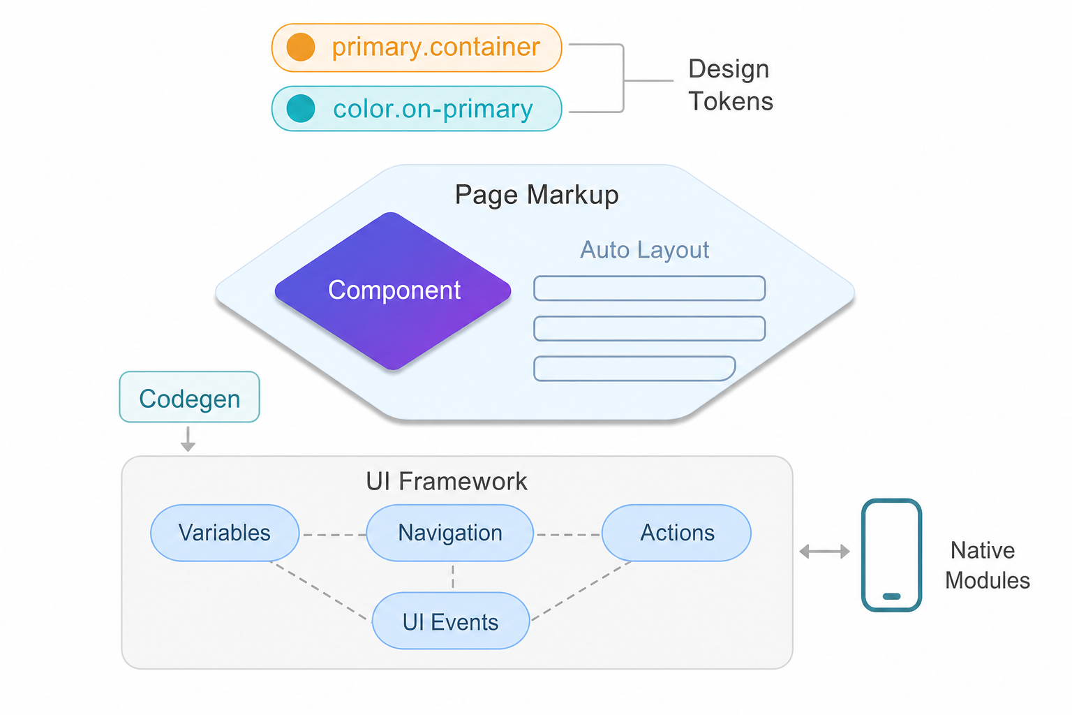
Design Tokens
Styling works through design tokens that map to React Native style properties. Each component token references a global token, and the platform resolves them at build time, eliminating manual style overrides for most use cases.
   btn.background=color.primary
   btn.font-size=label.large.font-size

   wizard.step.title.color=color.on-surface
   accordion.text.color=color.on-surface

   list.item.border-color=color.outline
   form.label.font-family=label.large.font-family
Auto Layout
Layouts can be created within a page or components using container Auto Layout, which provides fully customized layouting capability built on top of flex.
    <wm-container direction="column" alignment="top-left" gap="8" width="fill"
            name="container6" class="app-container-default" variant="default"
            wrap="false" clipcontent="false" padding="4px">
        ...
    </wm-container>
Components
Components provide behaviour customization through properties, events for UI event handling and variants to enable look-n-feel customization combined with design tokens.
    <wm-button class="btn-filled btn-default" caption="Button" type="button"
            margin="unset" name="button1" variant="filled:default"
            on-tap="button1Tap($event, widget)">
    </wm-button>
    <wm-switch datavalue="yes" name="switch2"
            dataset="bind:Variables.switchVarData.dataSet[$i].dataValue">
    </wm-switch>
    <wm-progress-bar datavalue="50" name="progress_bar3"
            class="app-progress progress-bar-default" variant="filled:default">
    </wm-progress-bar>
Variables
Variables provide integration capabilities enabling components to be bound to REST APIs or other supported data sources. Variables also inherently support managing state within the page context or across the application.
    sv_serviceVariableHireReq: {
        owner: "Page",
        category: "wm.ServiceVariable",
        ...
        service: "hirerequisition",
        operation: "invoke",
        operationId: "hirerequisition_invoke",
        operationType: "get",
        serviceType: "RestService",
        dataSet: [],
        isList: true,
        maxResults: 20,
        startUpdate: true,
        autoUpdate: true,
        inFlightBehavior: "executeLast",
        ...
    }
Actions
Actions provide routing capability to transition between pages, dialogs, notifications or messages.
    goToPage_FormComponents : {
        name : "goToPage_FormComponents",
        owner : "App",
        category : "wm.NavigationVariable",
        dataBinding : [ ],
        operation : "gotoPage",
        pageName : "FormComponents",
        dataSet : [ ],
        pageTransitions : "none"
    }
Events
Events in WaveMaker UI framework enable app developers to handle complex UI interactions across components, handle pre/post processing of data from API calls and fully customize application experience.
With events, developers can write client-side logic using JavaScript to fully customize application behaviour and take control of the user interactions.
    Page.button1Tap = function ($event, widget) {
        Page.Widgets.select1.dataset = ["min", "max", "same"]
        Page.Widgets.switch1.datavalue = "max"
    };

    Page.switch1Change = function ($event, widget, newVal, oldVal) {
        console.log('switch change')
        Page.Variables.MyService.invoke({
            value: newVal
        })
    };
Native mobile application
Application code generated in React Native adheres to Expo and uses architectural principles from the React Native framework such as components, navigation, state management and native modules. Platform generated code is readable, maintainable and secure for enterprise deployments.
UI concepts are AI-ready enabling agents to generate application artifacts from the intent, spec or designs provided by app developers.
Related Documentation
- TechStack - Technology stack for UI development
- Create a page and working with layouts - Page creation and layout containers
- Styling with design tokens - Design system tokens
- Variables and API integration - Managing application and page state
- Responsive design with layouts - Building responsive interfaces